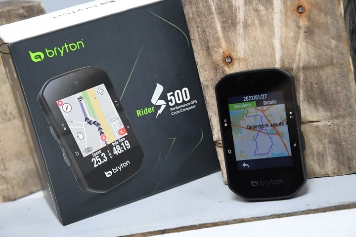
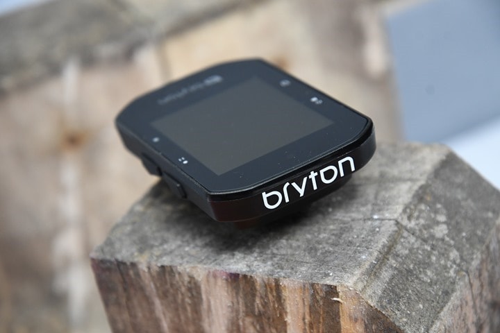
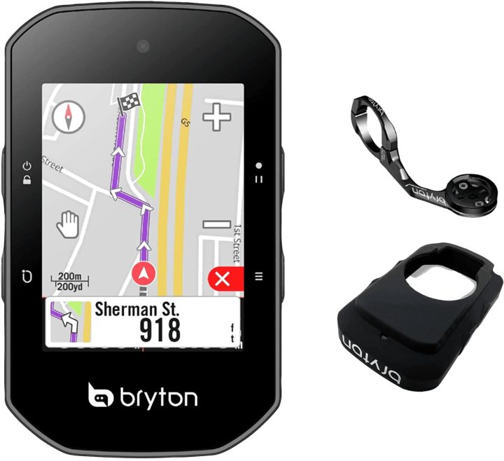
This past week Bryton announced their new Rider S500 cycling GPS. The unit adds in a new climb functionality (called Climb Challenge), as well as switching over to a USB-C port. It also notes increased brightness and battery, on a now brighter color touchscreen display, which is a smidge smaller than Garmin’s Edge 530/830, but a smidge bigger than the Wahoo BOLT V2.
For this post, I’m taking a First Ride approach, where I went out last week on a ride with the final production firmware. I also took a few other bike GPS units along with me on the road, to compare how they handled one of my regular routes. For the ride, I loaded up a route I created on Strava to overlay on the included maps, and then also paired up both a power meter as well as a heart rate strap. In theory, this would be a relatively easy route for most units to handle – both in terms of routing but also sensor data including GPS and altimeter aspects. After all – it’s farm roads in the Netherlands. There’s no elevation change and in mid-winter, there is not much tree cover either.
But, it’d serve as a good introduction to the unit, and help outline where things stand. And, post-ride is when I decided to shift this from a full review to more of a singular ride post, which, I’ll explain why later.
First though, let’s talk about what’s new here.
What’s New:
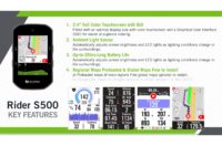
There are a number of new features in the Rider S500 (priced at $299/€299/£259) that are different from the existing and similar Rider 750, which is being retained in the line-up:
– Added new “Climb Challenge” feature
– Added automatic sync of structured workouts from app
– Added new long battery life screen-off option (but still recording)
– Increased visibility of display outdoors with more colors
– Added an anti-glare coating to screen (compared to Rider 750)
– Increase sensitivity of touch screen
– Added ambient light sensor
– Increased accuracy of the barometric altimeter
– Increased battery life from 20hrs to 35hrs
– No longer include Bryton to Garmin mount adapter in the box
– Switched to USB-C port (from micro-USB)
– Ability to use a USB-C cable to your phone to update maps & firmware
This last one is an interesting one. Most other companies use WiFi for updating maps, or a computer, but the Rider lacks that. I can actually see the logic of this though, especially if you’re traveling and forget to update/add maps ahead of time.
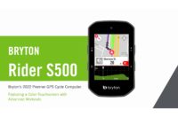
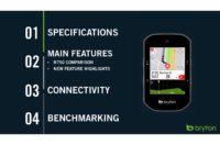
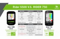
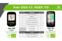
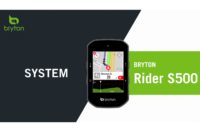
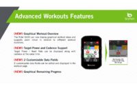
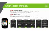
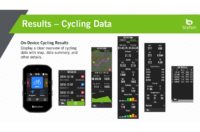
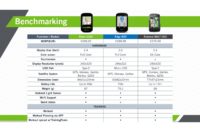
Now, Bryton has a handy package of slides that outline all the new/existing features of their product that they sent over as part of a media package. I often get these presentations for new product launches across the industry, and I really do wish more companies would just publish them. They’re usually very good and detailed on how the new features differ, and this one is no different. So here’s a nifty gallery of that slide deck. Note that Bryton has renamed ‘Climb Pro’ to ‘Climb Challenge’ in the final firmware on the units themselves.


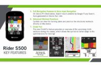
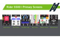

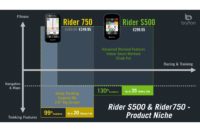
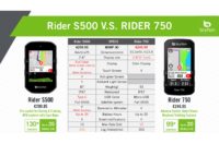




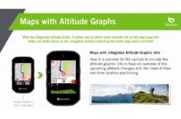
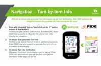
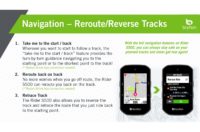
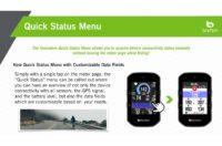
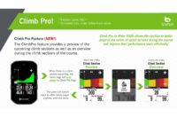
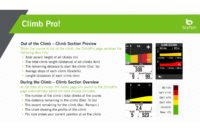
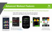


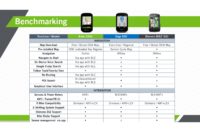

(Additionally, Bryon notes that there are also VAM, Lap Avg Slope/Altitude Gain, Lap Avg Slope/Altitude Loss data fields.)
So, about now you’re probably trying to figure out how this compares with their existing Rider 750. And honestly, that’s a bit tricky. You can see a direct comparison in their slides above, but here are the key differences:
– Rider S500 is $299 versus the Rider 750 is $249
– Rider S500 has 35 hours of battery life, whereas Rider 750 has 20 hours
– Rider S500 has a smaller screen though at 2.4”, whereas Rider 750 has a 2.8” screen
– Rider S500 has “130+ functions” whereas Bryton states “99+” functions for the Rider 750
– Rider S500 has USB-C, whereas 750 has micro-USB
– Rider S500 has improved display visibility and better touchscreen sensitivity
– Rider S500 is slightly lighter at 87g vs 93g for the Rider 750
– Rider S500 has automatic sync of workouts to the device, versus manual sync for Rider 750
– Rider 750 has group tracking and surprise me features though, which the S500 actually lacks
I do wonder long term whether or not having both so close in price ($50) makes sense, and similarly, some of the lack of group/surprise me features missing on the S500 that the Rider 750 has.
Unboxing and Size Comparison:
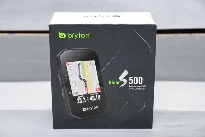
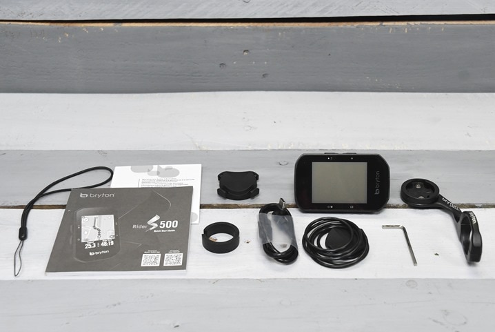
The Bryton S500 comes packed with not just the unit and some rubber mounts, but also a legit metal out-front mount. While some companies are including out-front mounts with their units, very few (except Stages) is including a metal one. So kudos there:
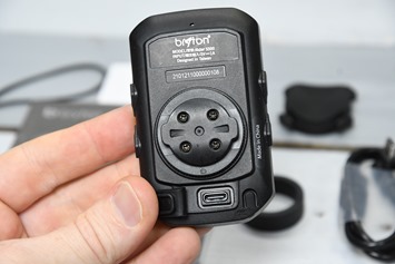
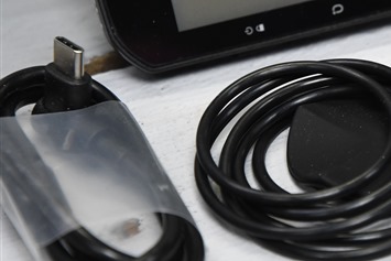
Here’s a quick look at that glorious USB-C port, also notably, they include an “L” style USB-C charging cable.
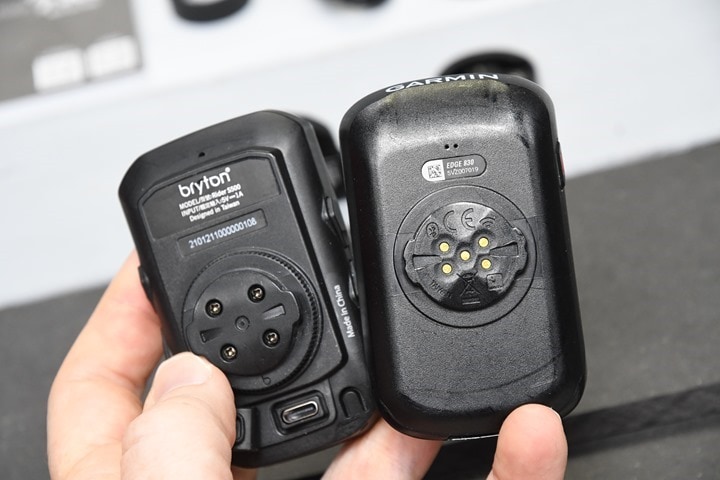
The back of the unit uses a Bryton quarter-turn mount, which is not compatible with the Garmin or Wahoo quarter-turn mounts. The Bryton one is a touch bit thicker, so it won’t fit in.
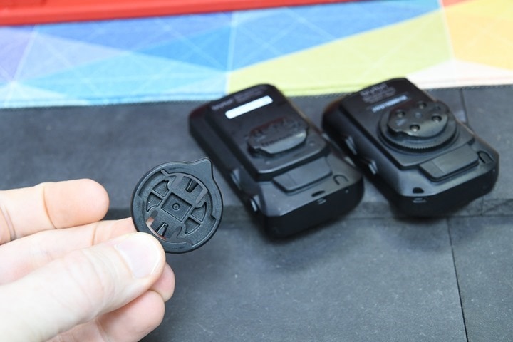
Instead, Bryton (as with Wahoo and Hammerhead) has a small adapter that connects to a Garmin quarter-turn mount. Curiously though, Bryton included this mount adapter (shown below) with the less expensive Rider 750 (also below, left), but it’s now an extra accessory to purchase for the S500. Though, it’s also slightly different on the S500 in that you actually unscrew the base Bryton mounting plate and swap it out.
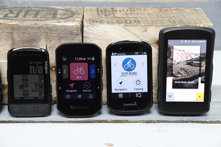
From a sizing standpoint, it’s in the same ballpark as their competitors – though, its stack/mount height is a bit higher due to a bit thicker quarter-turn mount system than either Garmin/Wahoo/others use.
Left to right: Wahoo BOLT V2, Bryton Rider S500, Garmin Edge 530/830 (identical case size, this is the 830), Hammerhead Karoo 2.
Ok, let’s get onto pairing it up and the first ride.
First Ride Experience:
Now, I’ve tested various Bryton units over the last decade – and in general, I come away from it with almost the same thoughts each time: It’s sorta OK, but feels clumsy and beta-like in so many areas. It’s never one major thing (well, most of the time anyways). But rather, just a lot of little things. Which isn’t to say other units are perfect (they aren’t), but they don’t have these sorts of beta-like mistakes.
Let’s start at the very beginning for example. After updating the Bryton Active app on my phone, it wanted me to re-login. No big deal, I’ve got a Bryton account already. Except, the password I was trying wasn’t working. Thus, I simply tapped “Forget Password?” button to reset it, and it fails. Or rather, it “fail”:
Why did it fail, you wonder? Because I typed “Ray” instead of “ray”. Thus literally, fail.
Being the geek that I am, I figured this out a short bit later. But how many others would have? And I know this might sound trivial, but as you’ll see – it’s a consistent pattern throughout the Bryton experience.
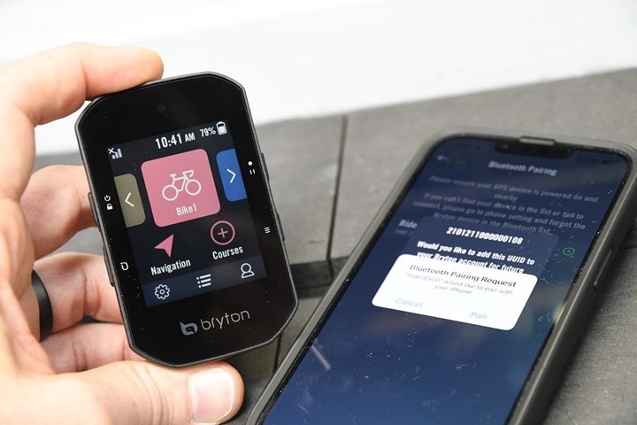
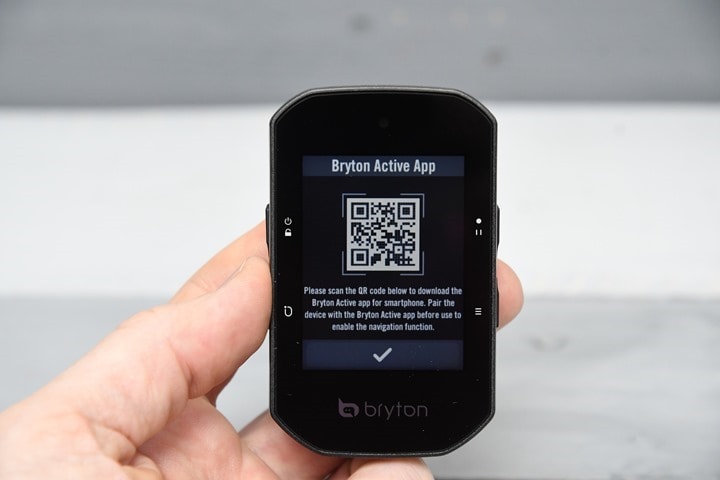
Once in the app, pairing was quick and efficient. It offered a QR code on the unit like the Wahoo/Apple pairing, but it didn’t need that. It found it right away, easily surpassing Garmin’s nightmarish Edge pairing process.
From there, I updated the firmware as normal. No biggie, totally normal for a new device.
But then it had me update it again. So, I had to update firmware twice. And then it asked me to reset all my Bluetooth stuffs. Not a huge deal – but again, why update and pair twice? Was there not a non-stop flight available?
After that, I validated my Strava connectivity was up to date, and then imported a route for the ride. This was as easy as you’d expect, though, I did have to manually select that ride to my unit, it didn’t just auto-sync Starred/Favorited routes like it does on my Wahoo/Garmin/etc units. Also, there wasn’t any option for Komoot routes, though Bryton says that and RideWithGPS are coming shortly.
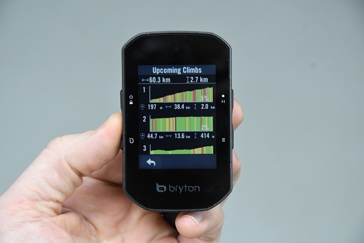
Now, one of the new features of the S500 is the Climb Challenge, which shows your climbs, akin to ClimbPro on a Garmin device or CLIMBER on a Hammerhead device. In my case, for last week’s ride, being in the greater Amsterdam area – I lack much in the way of climbs (a highway overpass would be the highest I could go). However, for fun, I transferred over one of my routes from a few weeks ago with far more climbing in it. Once the route is sent to the S500, you can load it up, and then tap to view the Climbs, you can then iterate through each of the climbs on this page (though, you can’t tap into them).
The climb breakdowns shown above basically match what both Garmin and Hammerhead did on my actual climb. The only nitpicking would be that most cyclists wouldn’t say “2.0KM” of elevation gain, they’d say “2,000 meters”. It’s a minor/nuanced thing sure, but as I’ve said countless times over the years, attention to detail matters.
Sadly, I don’t have a giant hill nearby to test this feature out, but, I did at least want to show that it exists.
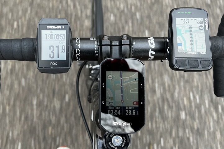
From there I did sensor pairing. That was quick and easy, pairing up my chest strap and power meter. It supports both ANT+ & Bluetooth sensors, including radar and smart trainers. With all that set, I headed out to begin my ride. My data displayed as I expected, and I could easily tap the page button to iterate between pages. I could see my route displayed as well, and all was good:
(Left to right: Sigma ROX 11.1, Bryton Rider S500, Wahoo BOLT V2)
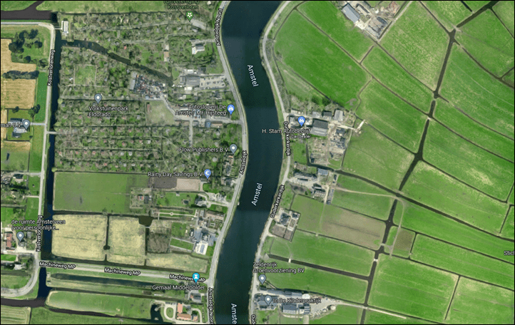
However, this is where we start getting into a slew of quirks. Each quirk by itself isn’t a big deal. But in total…well, let me show you. First up, we’ve got false turns. In this case, anytime the road along the river lazily bent, the unit would notify me of a turn/change in route. Except, this isn’t a change in route.
And this isn’t some sort of sharp-turn alert like some units have. I mean, look at this river in both the above Wahoo/Bryton map pictures, as well as below in the satellite imagery:
Next, around now it’s worthwhile noting that while my other units peppered me with notifications of an upcoming Strava Segment, the Bryton doesn’t support Strava Live Segments. Admittedly, I rarely care about these – especially on this day when I was feeling both lazy and battered by the wind. But I also recognize that like any other feature, one person’s most important feature is another person’s “don’t care”.
Now, for the next while, things worked as expected. It showed my data as expected, including power, cadence, speed, and more. It showed my heart rate too, at least until my heart rate strap’s battery died. But we certainly can’t blame that on Bryton. There was an initial re-routing due to construction that all the units got slightly wrong, because the road no longer existed as of the last few months. But that’s fine, I can’t blame any of them for that either. Data showed as expected, and I chugged along into the wind.
However, there were more quirks to come. For example, check out how it displays road names (they literally stacked them, especially on the left side):
How on earth is that readable? Neither the entire words were displayed, nor, is it legible at a glance. Of course, many other units don’t display road names at all on the maps – which in some cases is the right move to make as it often just adds clutter unless heavily zoomed in. In this case, the actual road name below is “Rondehoep Oost”, not just “Oost” (East).
However, trouble came later on during my route when I purposefully “missed” a turn to see how it’d handle re-routing. I first purposefully missed a turn, and then simply turned across the bridge, and stayed on the opposite side of the canal for a few hundred meters, essentially paralleling the route. You can see how the Wahoo BOLT (below) by now understands that I just want to keep on going straight and meet the route (just out of frame on this map). I’m the red dot on the Bryton screen, and that dark blue line you see at the bottom is it wanting me to turn around.
So the Rider S500 not only did not approve of my life choices, but seemed to indicate it wanted to route me on a u-turn, backtrack a bunch, and then out somewhere else, presumably eventually back to where that purple line is.
I don’t know where exactly it was re-routing me (it was off-screen), but it certainly wasn’t to the nearest point of the track, nor to home. I can only presume it was thinking “As punishment for missing this turn, we’ll have you do the entire loop again. Maybe next time around you won’t eff-this-up.”
Eventually, after it got upset about another brief me-inspired re-routing (this time due to re-cobble-stoning of a street section), it calmed down and started routing again once I joined up the previously planned route. At this point, the remainder of the ride home was normal. The data from the unit looked normal, as did the GPS tracks – zero issues there (though I’ve also never had a unit fail the GPS test on this route, it’s mostly farmlands aside from the first few blocks with some tall city buildings).
It’s worth noting though that the Bryton S500 *CANNOT* re-route without your phone. It requires your phone, the Bryton Active App, and an active internet connection in order to re-route back to the track or take you back to the start/track. In my case, I had both the app active as well as the internet, so that wasn’t the issue.
Post-ride, the unit then synced normally from the S500 to the app, and onto Strava. All of that worked as expected.
Wrap-Up:
I’ve been doing ‘First Ride’/’First Run’ type posts for the better part of a decade. These give me quick impressions of a unit based on that single point in time. Sometimes that works out well for the product in question and it performs perfectly. Other times, the Failboat will arrive in a spectacular fashion. Such is life – and no different than any other consumer going out for their first use of a new product, which may or may not result in them immediately returning it.
But one of the things throughout the years is that it’s usually easy to delineate between a single Bad Day, versus inherent and more systematic issues. For example: Horrible GPS or optical HR accuracy? That could be a one-off for any number of reasons. Or not. But it’s worth investigating further with future rides/runs/testing. Whereas, things like poor user interface design on both the app and unit? That’s not a bug – that’s by design.
An example of a middle-ground option is routing/re-routing and navigation. This can be highly dependent on the roads, and in some cases, even just a very specific intersection or area/region. Then there’s the difference between a complete routing failure (crashing/etc), and a non-optimal route (choosing an OK but non-local knowledge route). In the case of my routing failure above, it’d likely err towards routing failure. I don’t know where exactly it was eventually going to route me, but it appeared heading off to the countryside/cows and very much not in the direction of my destination. I’ll never know where that would have taken me in life, but I know it wasn’t towards home and making dinner.
When I step back and look at Bryton GPS units over the years, the story largely seems repetitive. While the hardware itself tends to be fine, the user interface and menus continue to be cumbersome and clunky, and often poorly translated (if at all translated in some cases). In fact, these are literally the exact same complaints I had 9 years ago when I first reviewed one of their units. Here we are in 2022, with a number of options on the market, all of which are roughly the same price, and heavily polished – both at the device level and at the app level.
Bryton deeply needs to hire the most nitpicking UI designer on any continent they can find. Someone that oozes purpose and reasoning for every single button and tap in a device/app. Someone that would make Apple’s notoriously clean UI look sloppy. Someone who isn’t afraid to use that electronic red pen and tablet, all to rip through their device and app pointing out all the inconsistencies.
Because setting aside the routing failure, Bryton does get the core data right, which is hard to do. They do a good job of connecting to every cycling sensor type you’d want, and displaying that data properly. And while they copied Garmin’s ClimbPro (literally by name, initially), at least they’ve got something there for climbing. A feature area that Wahoo is still missing. Similarly, Bryton has USB-C, which Garmin still lacks on any cycling devices. Point being, while Bryton has made a good cake base, the icing kinds looks like this.
The bigger challenge though, is that historically Bryton has always undercut on price to make up for this gap. But that pricing difference has virtually evaporated now, especially given the S500 can’t re-route without your phone/internet. And unfortunately, as both myself and many others have pointed out over the years, and even others on this very unit, the user experience continues to disappoint.
With that, thanks for reading!
Found This Post Useful? Support The Site!
At the end of the day, I’m an athlete just like you looking for the most detail possible on a new purchase. These posts generally take a lot of time to put together, so if you're shopping for the Bryton Rider S500 or any other accessory items, please consider using the affiliate links below! As an Amazon Associate I earn from qualifying purchases. It doesn’t cost you anything extra, but your purchases help support this website a lot. Even more, if you use Backcountry.com or Competitive Cyclist with coupon code DCRAINMAKER, first time users save 15% on applicable products!
And of course – you can always sign-up to be a DCR Supporter! That gets you an ad-free DCR, access to the DCR Quarantine Corner video series packed with behind the scenes tidbits...and it also makes you awesome. And being awesome is what it’s all about!

![clip_image001[7] clip_image001[7]](https://media.dcrainmaker.com/images/2022/02/clip_image0017_thumb.png)
![clip_image001[9] clip_image001[9]](https://media.dcrainmaker.com/images/2022/02/clip_image0019_thumb.png)
![clip_image001[11] clip_image001[11]](https://media.dcrainmaker.com/images/2022/02/clip_image00111_thumb.png)
![clip_image001[13] clip_image001[13]](https://media.dcrainmaker.com/images/2022/02/clip_image00113_thumb.png)
![clip_image001[4] clip_image001[4]](https://media.dcrainmaker.com/images/2022/02/clip_image0014_thumb.jpg)
![clip_image001[12] clip_image001[12]](https://media.dcrainmaker.com/images/2022/02/clip_image00112_thumb.jpg)
![clip_image001[8] clip_image001[8]](https://media.dcrainmaker.com/images/2022/02/clip_image0018_thumb.jpg)
![clip_image001[10] clip_image001[10]](https://media.dcrainmaker.com/images/2022/02/clip_image00110_thumb.jpg)
![clip_image001[6] clip_image001[6]](https://media.dcrainmaker.com/images/2022/02/clip_image0016_thumb.jpg)
![clip_image001[14] clip_image001[14]](https://media.dcrainmaker.com/images/2022/02/clip_image00114_thumb.jpg)

0 Commentaires