Stages have just announced two new bike computers, the new Stages Dash M200 and L200. These3rd generation units are hardware upgrades to their predecessors, the M50 and the L50. In Stages Dash lingo, M simply stands for a medium-sized unit, and L for the Larger display unit. The software features and functions are identical, though they do have differing battery capacities.
The biggest difference in the M200 and L200 compared to the past units is the significantly changed hardware. Gone are the miserable buttons, as well as the more streamlined but very fiddly mount. They’ve been replaced by easier to press buttons, and a Garmin-style quarter-turn mount – making it compatible with basically every 3rd party bike mount out there, including those built into numerous bikes. But they’ve added WiFi for a variety of tasks, including easy map downloading.
Now interestingly, this new head unit is a collaboration with Giant (who makes bikes and stuff). Stages utilizes Giant manufacturing in other areas of their business, such as their indoor bikes. There will be variants of the Stages M200/L200 units that are sold under Giant branding, but otherwise identical internally. We’ve seen those already teased on Giant’s WorldTour sponsored team, Team Bike Exchange-Jayco.
It should be noted that for today’s post, I’m going with a hands-on format rather than a full in-depth review. This is largely because I simply haven’t had enough rides on it to feel confident for the depth of a normal review. I’ll do a full in-depth review down the road in the next month or so, once I get more road-time, and perhaps some of the upcoming software features noted below.
With that, let’s dive into it!
What’s New:
The bulk of the changes on the Stages Dash M200/L200 series fall in the realm of hardware, rather than software. However, some of these hardware changes drive software changes. For example, the addition of WiFi means that there’s now new menus around WiFi Map downloading (direct from the unit). Further, there are additional changes coming over the next few months that fill in some of the software gaps (more on that in a second).
– Added WiFi for sync and map downloading
– Increased battery from 15hrs to 18hrs (M200), battery same at 18hrs on L200
– Increased water resistance from IPX7 to IP57 (1-meter deep for 30 mins, plus now dust resistance)
– Decreased weight from 95g to 77g (M200)
– Decreased weight from 127g to 105g (L200)
– Changes buttons from miserable to good
– Changed mount to quarter-turn
– Maintained same display size (2.2” for M200, 2.7” for L200)
– Complete massive redesign of the user interface
– Added ANT+ E-Bike Integration
– Added automatic profile feature for figuring out which data to display without config
– Added automatic sensor scanning for finding new sensors (you can disable it)
– Added Time in Zones data fields/page
– Completely new/revamped companion app (totally new app)
– Price increases from $249 to $279 (M200), and $299 to $329 (L200)
Note that all of the above new software features were also added to the massive software update that occurred last month for the Stages Dash M50 and L50. That includes automatic profiles, automatic sensor scanning, plus the full user interface redesign (and boatloads more features). Again, check out that huge list to see everything new/tweaked.
Now, it has to be said that the units still contain micro-USB, which is a pretty big bummer. I was hoping/expecting USB-C. Stages said they wanted that too, but they simply couldn’t source the compatible USB-C parts they wanted in time, based on current availability. But, they did note they absolutely see USB-C as their future.
Next, there are still some obvious gaps in the lineup today. Things that weren’t on the original Dash units either, but that Stages says they know they’re short on. All of these are in the pipeline for
– Automatic turn-by-turn for Strava & Komoot synced courses (more on that in the post): ~1-2 months from now
– Climbing related feature: ~3 months from now
– Di2 & eTAP sensor support: ~2 months from now
– WiFi Uploading of completed rides (currently via USB/Bluetooth): ~Next week
The company noted that while they don’t see it as an excuse for some of these features to be omitted, the bulk of their software development team is based in Ukraine. That team actually largely continues to work (and Stages says their families are safe at this point), but at their own insistence, they wanted to keep working to maintain some normalcy.
In terms of ‘normal’ bike computer features, it basically has everything you’d expect these days. It has dual ANT+/Bluetooth Smart sensor support (including Varia Radar support), it’s got mapping and navigation, structured workouts, trainer control, as well as full sync of your ride to Strava and numerous other partners. It works both on-road and off-road
The New Hardware:
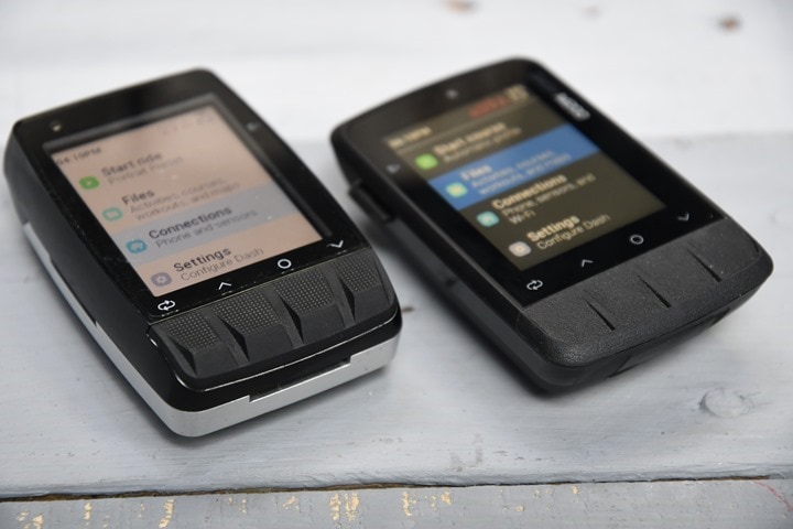
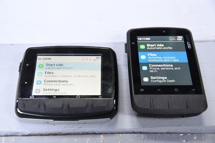
So first up, we’ve got a quick look at the hardware itself, starting with the M200. You’ll notice the new buttons are so much better than the older ones. These ones are indented, which by itself isn’t really the best part. It’s the fact that you can press them without feeling like you’re going to break your front fork trying to get the button to register (left is older M50, right is newer M200).
I’d say I still like the BOLT V2’s buttons a bit better here, as there’s a bit easier to press. But the M200 buttons are worlds better than the M50’s original ones.
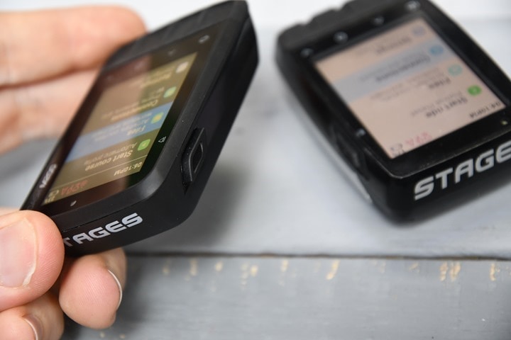
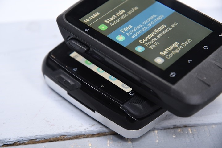
Next, you’ll notice the side button was moved from the right side to the left side. Also, it got really excited and got really big:
This makes it pretty easy to find/press when stopping/starting.
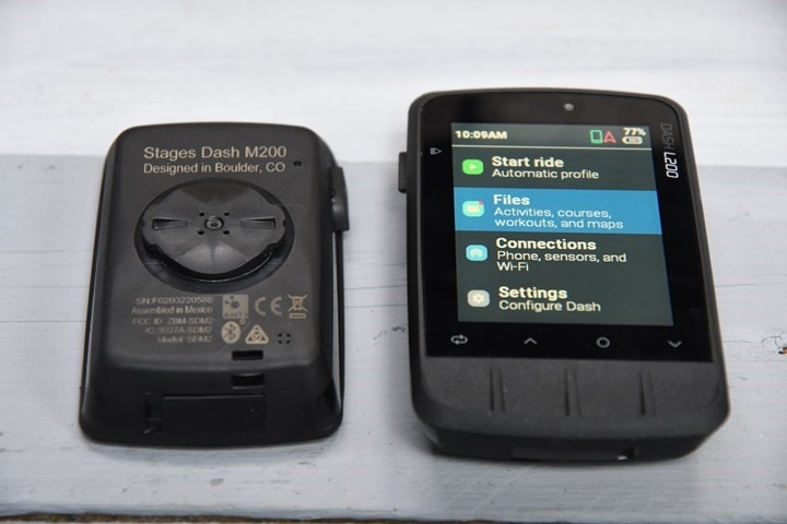
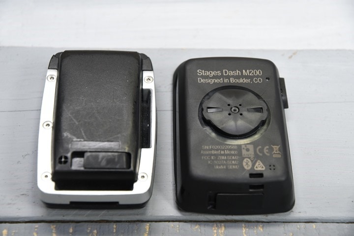
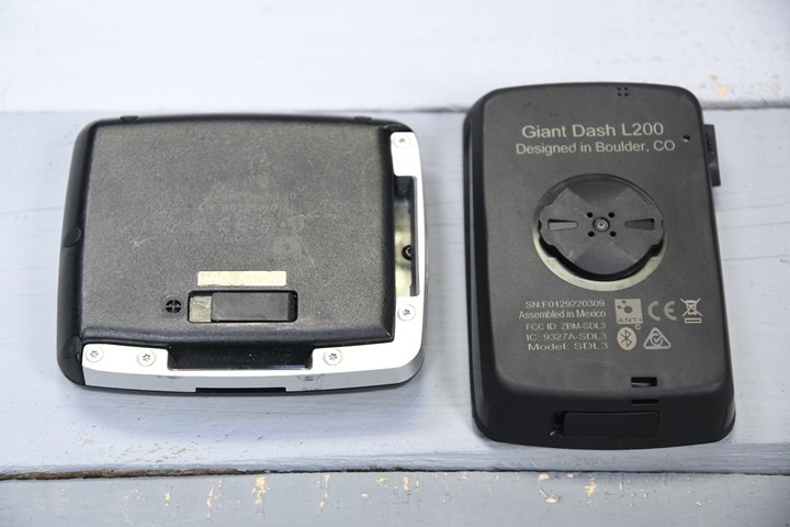
Flipping the unit over, there’s the new quarter-turn mount. You’ll notice the Stages proprietary mount is gone. While Stages did all they could to make a gazillion mount-varieties for the old design (and, it was super-slim mounting). But at the end of the day, people just want a Garmin quart-turn compatible mount, because that’s what so many 3rd party mounts (and now bikes) have on them. Even Wahoo, Karoo, and others make adapter plates to mesh into a Garmin quarter-turn mount.
Now notably, Stages did not remove the ‘portrait’ mode orientation from either M200 or L200. So you can still mount it sideways if you want. And that’s because certainly you can always just use a rubber-band style mount rotated, and even most 3rd party out-front mounts allow you to rotate the bike mount plate in 90* increments with the screws underneath.
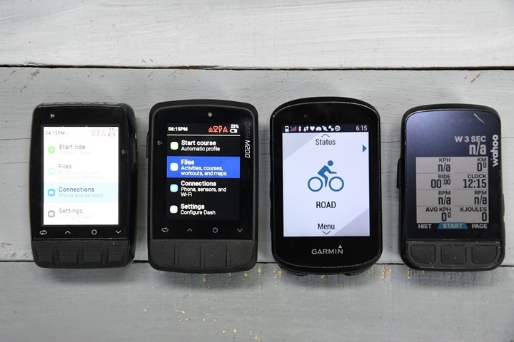
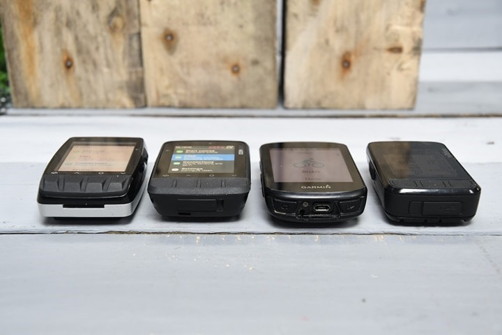
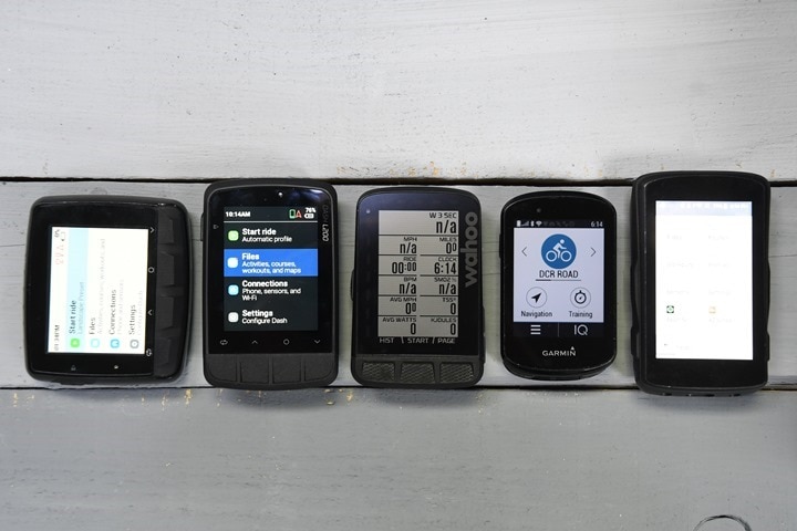
Here’s a super-quick comparison between the similarly-sized/priced Stages Dash M50 (older), Dash M200, Wahoo BOLT V2, and the Garmin Edge 530/830 (same size/screen). The screen brightness levels are *VERY MUCH* not set the same on these. I’ll fix that for a full review. But, as with before, the Stages M200 screen is bright AF.
Next, there’s the L200. All the design decisions are the same as with the M200, so I won’t re-hash that text again. But here’s the buttons (L50 at left, L200 at right):
The side-button:
And the back quarter-turn mount:
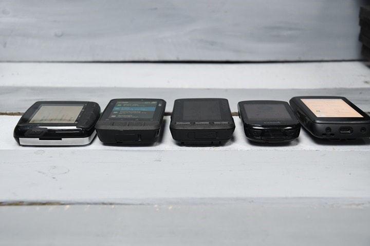
Then a comparison between the similarly sized Stages Dash L50, L200, Wahoo ROAM, Garmin Edge 830, and Hammerhead Karoo 2 (again, brightness levels were not normalized here…sorry!):
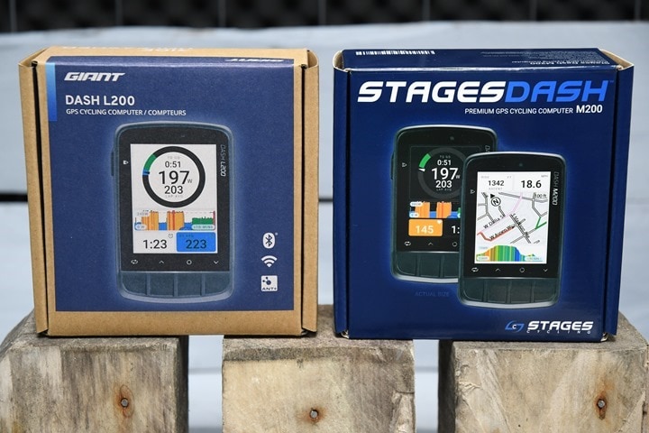
Oh, and in the box for these? Ask and you shall receive. Note the Giant-branded box in my case for the L200, whereas the Stages branded box for the M200.
With that, onto the first ride.
First Ride Experience:
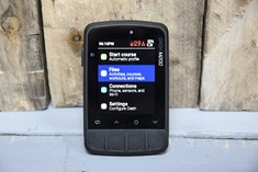
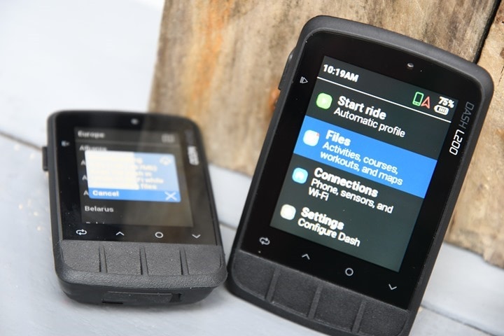
The single biggest change you’re going to notice right away is the vastly improved user interface of the M200/L200, using the new software design. This of course was just rolled out to the older M50/L50 units last month, ahead of the M200/L200 release. It’s just a heck of a lot more logical. Gone are many of the weird quirks that didn’t really make sense in terms of just starting a ride. Previously everything was kinda scatter-brained, but now it’s logical with core groupings to find courses, workouts, and settings easily accessible from the home screen:
Because I made the stupid decision to fly away from the Netherlands during the nicest weather all year, by time I returned it was somehow snowing again upon landing. And thus, the last week has been solidly miserable, snow/sleet in the morning, with 40MPH winds all day. It’s awesome. So awesome in fact that I figured I’d ride back to the airport to see if a plane would take me away.
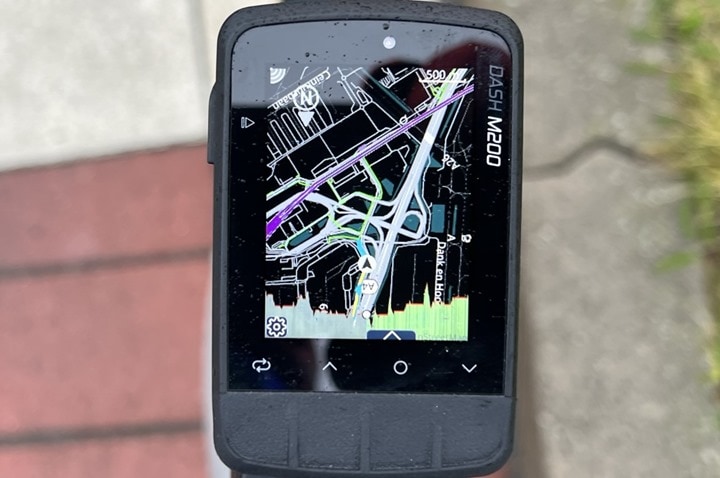
So I created a route in Strava first, then loaded it up in the Dash M200:
I also paired up my power meter, heart rate strap, and Varia radar as well, which you can see here:
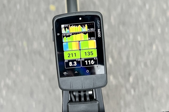
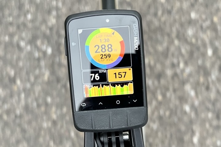
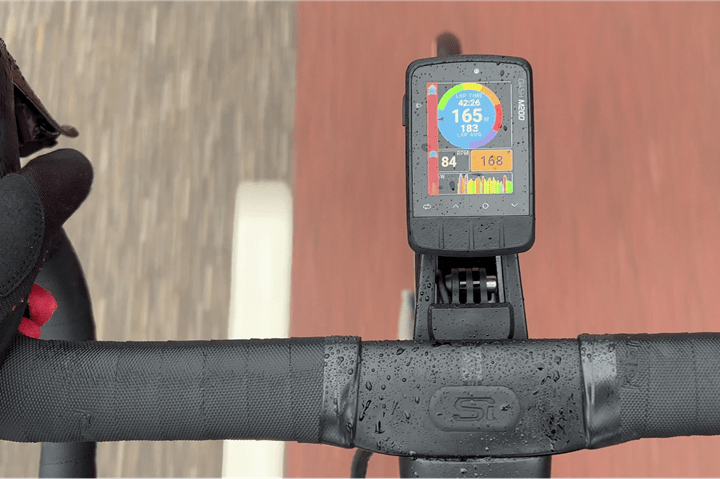
The unit showed the data fields I’d expect without me needing to create some new activity profile. Certainly, I can still do all that if I wanted to – but this basically just worked straight out of the box showing me the data fields I’d expect, automatically.
The one thing I didn’t get though, and surprised me (meaning, I’d forgotten about it), was that Strava routes that sync automatically, don’t get turn-by-turn instructions. I guess I’m just used to that on Garmin/Wahoo/Hammerhead.
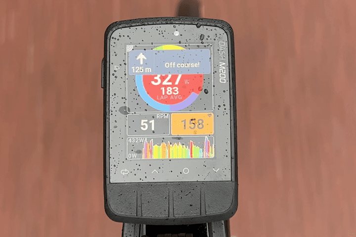
Instead, you just get a line you’ll follow manually (and off-course warnings):
In order to get turn-by-turn instructions, you need to export out the course file from those platforms, and then import it in (which will include the instructions). Obviously, in 2022 that’s not good enough. Stages said though that proper turn-by-turn instructions is coming to the Dash, likely in about 1-2 months, for these platforms.
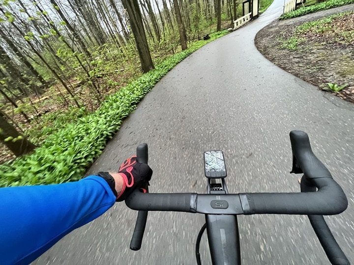
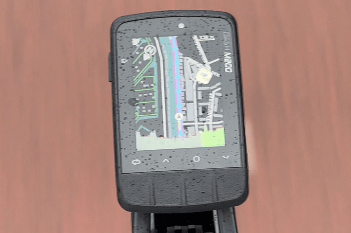
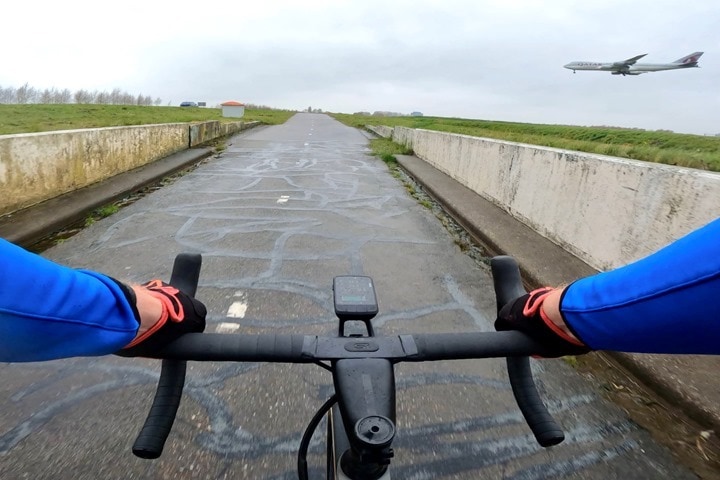
In any case, I kept on riding along into the wind, rain, while JET A wafted by from the overhead 747’s:
Everything else worked exactly as expected. It was reasonably easy to press the buttons used my gloved fingers, and the response time was prompt and efficient.
The one thing you do see a bit though is some display distortion at the lower edge when you press the buttons in certain scenarios, at the lower edge. Stages said this is expected because of the higher quality display they use, and that it doesn’t hurt the display. It’s hard to see indoors, but is slightly more noticeable while riding.
Overall though, my ride went well, without issue. If I look at the GPS track, it’s largely good and matched the Edge 830 and Garmin Descent G1 on road, however, there’s some slight GPS variation in the trees when I went through some forested areas. Thus, I’ll probably do some proper mountain biking as part of my full review, to ensure things are crispy there as well.
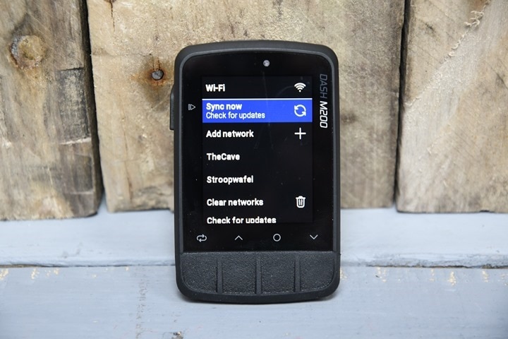
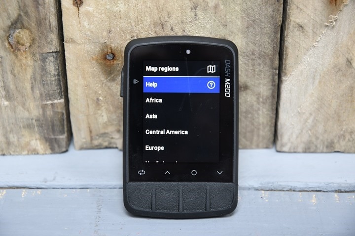
Finally, since one of the new features is the WiFi, I figured briefly mention that. I’ll dive into it in more detail in my review though down the road. First though, you’ll add a WiFi network either from the smartphone app or the unit itself (I did two networks, one via each method). It’ll validate the connection and then be good to go.
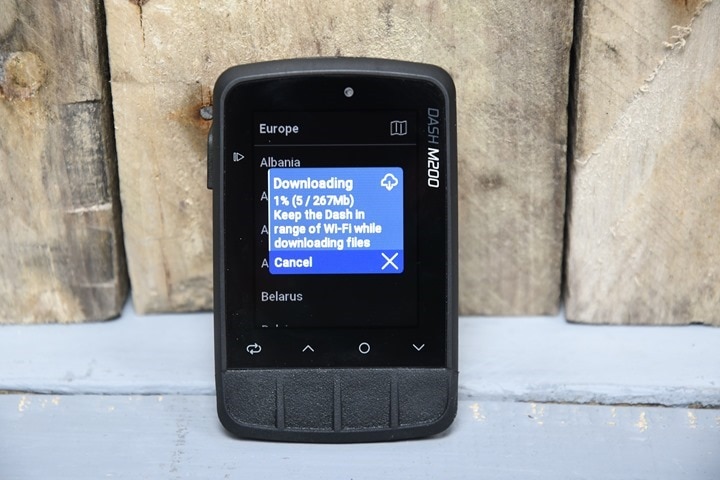
As of right now, the WiFi connection is mainly used for map downloading – but coming next week it’ll also do activity sync. For map downloading, you can either choose a map from the app or the unit itself. Again, that’s always been a theme of Stages – choose wherever you want to manage anything you want.
As it starts downloading the maps via WiFi, you’ll see a progress bar. It’s reasonably quick, taking only a minute or two for the Netherlands. Far quicker than Garmin’s Fenix 7/Epix series units download over WiFi (which can take 3-4 hours over WiFi for the larger map sets). Granted, the wearables have far lower power constraints than a larger bike computer. Also notably, you can do this at the per-country level – whereas Garmin groups countries together. And in the US, at the per-state level.
Roughly speaking, it was downloaded at 2-3MB per second (or 120-180MB/minute). For random reference, France was about 1,100MB, and Spain about 400MB. So about 2-3 minutes for Spain – and about 5-8 or so for France. Perhaps it downloads faster while plugged in, I didn’t try.
Still, this is all super-easy to do.
Wrap-Up:
For Stages, the transition from M50/L50 to M200/L200 was clearly heavily skewed towards hardware, with them obviously working behind the scenes to level up the usability of the entire Stages Dash family (including older units) with the major software release. This means they’ve largely removed any hardware-related complaints one could have about their units (save perhaps annoyances with lack of USB-C), and also have made their units far easier to use – especially out of the box.
The next step for Stages is catching up on some of the software-related features, especially the turn-by-turn navigation and climbing-related functions. Both of which are critical to bike computers in 2022. The good news there is Stages says they’re only a few months out from having those completed, as well as some more minor lingering things to tweak (like Di2/eTAP sensor support – which is useful, but not a major thing in my mind).
Overall, the responsiveness and usability of the new user interface is solid, and the buttons are a huge step-up from before. The display continues to be a lighthouse of brightness and clarity, and they maintain the 15-20hr battery life than most other units in this price ballpark are at.
I’ll be doing more rides – both on and off-road over the coming month or so to put thee through their paces, including getting some elevation at some point too, to validate that aspect of it. So stay tuned for a full in-depth review down the road…or trail.
With that – thanks for reading!


0 Commentaires